
100 Email Marketing Best Practices, Ideas and Examples
Strategies & Ideas
- One Call-to-Action Maximum
- Design for Thumbs
- Create Urgency by Setting a Deadline
- Emails with a Single Image Have The Highest Click-through-Rates
- Use Templated Emails for “Pull” Content and Personal Ones for “Push” Content
- Optimize Subject Lines for Mobile
- Avoid Email Spam Trigger Words
- Give a 1-2 Subject Line Punch by Leveraging Pre-Header Text
- Don’t Automate your Greeting.
- Use the Power of the P.S.
- Use Numerals
- Send a Reminder Email
- Speak to the Lizard Brain
- Write your Marketing Emails like you Write Emails to your Friends
- Use Personal Examples and Offers
- Top Performing Keywords for Benefit-focused Subject Lines
- Top Performing Keywords for Clickbait Subject Lines
- News
- How-to
- Discount
- Command
- Personal
- Reason Why
- Price
- Urgency
- Use a Consistent Layout for Every Email
- Include Company in From Name
- The 9-word Reengagement Email
- Clarity Trumps Creativity in Subject Lines
- Use CoSchedule’s Headline/Subject Line Analyzer
- Use Grammarly to Check your Grammar and Spelling
- Specificity Rules
- Tap into Exclusivity
- Mix up your Sentence Structure
- Use active voice
- Lose all the jargon
- Do A CRABS Check
- Use a Person’s Name only Once
- The “You Are not alone” Subject Line
- The “Last Call” Formula:
- The “Don’t Buy This” Formula:
- The “Social Proof” Subject Line
- The Invitation
- The “What If” Email Formula:
- The “Never Met/Seen” Email Formula:
- The “Normally” Email
- The Problem Email
- The “Big Mistake” Email
- The Lessons Email
- Quote a B.U.D.A.
- The Dotted Cliff-hanger
- The “How Can I Help You” Welcome Email
- Use a Single CTA Button
- Make Subscribers Feel Like They’re Getting Access
- Make Your Emails Feel like a Continuous Conversation
- Use the “People Like You” Effect
- Leverage the Zeigarnik Effect
- Don’t Use Fake Urgency Tactics
- Use Countdown GIFs to Increase Urgency
- Use Pre-filled Form Fields
- Use Auto-submit URLs in CTA buttons
- Setup your DKIM and SPF
- Use Alt text properly
- Follow the CAN-SPAM Basics
- The Best Times to send emails: 8 a.m. – 10 a.m. and 3 p.m. – 4 p.m.
- Say No to No-reply From Email Addresses
- Welcome New Subscribers with a Quick Win
- Don’t set it and forget it
- Use a Prepared “Click to Tweet”
- Stop Unsubscribes with a ‘Reason You Unsubscribed’ Message
- Use Transactional Emails to Provide a Bonus Offer
- Squarespace
- Dropbox
- Vero
- Death To Stock Photos
- Shopify
- Adobe Creative Cloud
- Litmus
- Quora
- IFTTT
- Booking.com
- Members Only
- CreativeMarket
- Tumblr
- Yelp
- EventBrite
- Later
- Mint
- 500px
- Jaybird
- ApartmentTherapy
- SSENSE
- Haven
- Fred Perry
- Freshbooks
- Big Sea Design
- Bodybuilding.com
- VSCO Film
- Fancy
- Buffer
- Inbound.org
1. One Call-to-action maximum
For the highest conversion rate possible it’s best to have only one call-to-action in your email. Period.
Having more than one CTA creates too much choice and confusion. As the number of choices increases, the recipient may feel that making a decision is too complex. The conversion goal should be clear and the recipient should only have the choice – claiming your offer or not.
It may be tempting to stuff your emails with as many CTAs as you can but that may backfire. If you desperately need to have more than one CTA make the most important one, largest or first.
Philips Sonicare ran a multivariate test to find out which of their newly-designed emails would convert the best. They found that the plainly designed emails with a single CTA converted far better than the other well-designed variations.
Don’t muddle your CTA or overcrowd it with other links, images, and text. The more decisions you ask your users to make the greater chance they won’t make one at all.
2. Design for Thumbs
Half of all emails are now opened on mobile devices. Remember this and design for smaller screens. Things like buttons should be made large enough to be clicked on small screens. Add lots of white space so that information can be read easily and CTAs can be seen/clicked. You don’t get much real estate on small devices so make use of all the space and most importantly, use a responsive layout.
3. Create Urgency by Setting a Deadline
Don’t use a manufactured or fake deadline. Create a sense of urgency by explaining your offer and the need for it to be claimed immediately. Smart marketers do not rely on fake deadlines and ruin the trust they’ve built with their audience. Instead create a deadline for your offer and stick to it. Your audience will know then that your offers are real and jump at the opportunity to claim them.
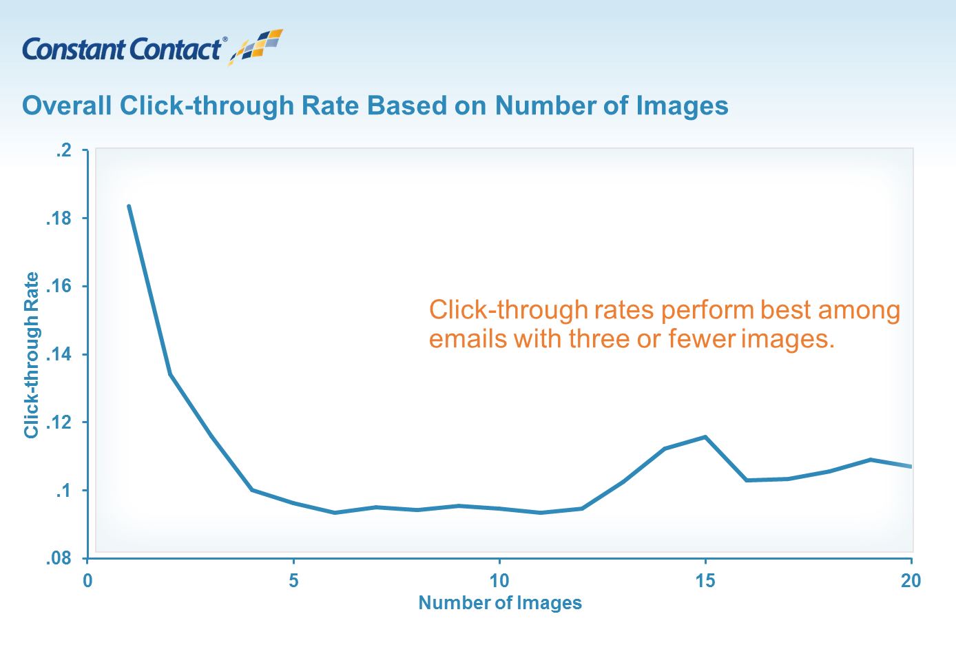
4. Emails with just one image have the highest click-through rates
ConstantContact analyzed over 2.1 million customer emails and found that emails with only 1 image had the highest click-through-rates.
Now that over half of all emails are opened on mobile devices, shorter, more concise emails perform better. It’s safe to say that recipients favor emails they can read at their desktop or on the train on their way home.
5. Use templated emails for pull content and personal ones for push content
Templated emails are ones that are built using a prebuilt template. Email newsletters, for example, might be written and styled with some sort of email software. They look like a physical newsletter and are obviously not custom-created each time they’re sent out.
Email newsletters are what are considered “pull” content – meant to ‘pull’ traffic to your website. Email newsletters are sent to a large audience so it helps to use a prebuilt template to help you efficiently send something appealing to all your leads.
“Push” content, on the other hand, should be made personally to ‘push’ a recipient towards some sort of goal, like signing up for a free trial or downloading a case study. These emails are sent less frequently and are meant to build a relationship between a seller and buyer. Use personal, non-templated emails to increase the authenticity of your offer and make it clear that it’s being sent by a human and not a faceless robot.
Email Copywriting Tips
6. Most Mobile Devices only allow for 33-38 character long subject lines
Christa Sutherland of MailerMailer says that, “According to MailerMailer’s 2015 Email Marketing Metrics Report, messages with medium-length subject lines yielded the highest open rates. More specifically, those with subject lines of 28 to 39 characters resulted in the highest average open rate of 12.6%. In comparison, messages with the shortest subject lines (4 to 15 characters) produced an average open rate of 12.1%.”
About 50% of all emails are opened on mobile devices, which have grown in size throughout the years. This means more screen real estate and more room for characters in email subject lines.
Remember that your email subject line is more important than the content of the email. Why would the content matter if the email isn’t even opened?
7. Avoid Email Spam Trigger Words
To the chagrin of many marketers, webmail services like Gmail have become increasingly better at filtering out promotional and spam emails. These spam filters work by filtering out specific trigger words that are highly associated with spam emails.
To save your emails from being filtered directly to the trash it’s best to avoid using ‘spammy’ trigger words in your subject lines. Well known spam phrases like “Earn $”, “Work from home”, “Miracle” or “Meet singles” get sent directly to the spam folder.
8. Give a 1-2 Subject Line Punch by Leveraging Pre-Header Text
Preheader text is the text that comes up after the subject line in the email. By default yours might show something like:
- Having problems viewing this email? View online
- To ensure delivery to your inbox, add us to your contacts
- Can’t see this? View in browser
That is a missed opportunity for some text that supports the subject line.
The red box in the example below shows where the pre-header text is placed in Gmail.

Take advantage of pre-header text by adding in some important info to support your subject line. Something like…
- Free Shipping All Week!
- Check out our mobile site
- Buy one get one free
Preheader text, along with the subject line, is the first thing recipients see, so it helps to add more information to get them to open the email. It gives the recipient a little preview as to the content of the email so make sure it is extra persuasive.
9. Don’t automate your greeting.
Try warm wishes, best regards, or “greetings from sunny England.” Mixing up your greetings makes you less robotic and more personal.
Instead of using a generic greeting like ‘Hi’ or ‘Hey there’ try mixing things up with something a bit more natural. The key here is to make your emails appear more personal and less automated.
10. Use the power of the P.S.
According to CopyBlogger, a P.S. at the end of your emails ranks as one of the things recipients most frequently remember. A reader will always read the P.S. because it sticks out as an odd element that is separate from the content.
A P.S. is also the last element on the page, thus making it easier to remember so use it to reinforce one of your offers.
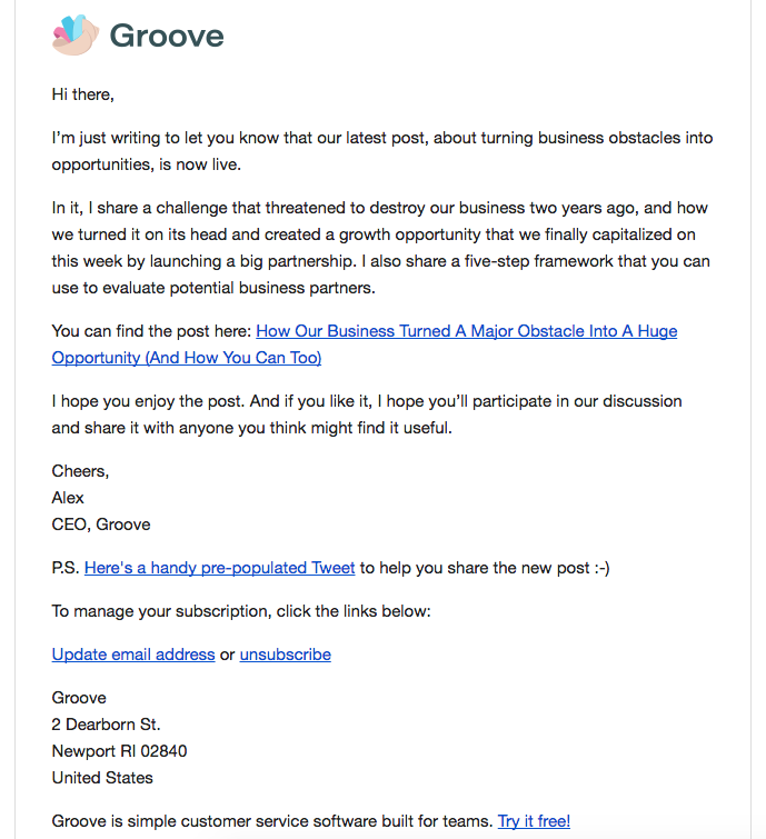
Alex from Groove uses a P.S. in his emails to get recipients to share his most recent article with a handy pre-populated tweet.
11. Use Numerals
Instead of writing ‘twenty three’ write ’23’ to catch the attention of those who only skim through content. Numerals stick out amongst text, especially long and large blocks of text according to Nielsen Norman Group research.
12. Increase Newsletter Open Rates with a Reminder Email
Have a promotion running or an event coming up?
A reminder email is one of those email best practices that can make your recipients act. Using automation, you can schedule an email to be sent out a week or two before your offer expires. It’s a gentle reminder that time is expiring and that they need to act soon to claim your offer or to save their spot.
13. Speak to the Lizard Brain
The Lizard Brain might sound like a weird type of artisanal beer but we are all said to have one as a direct result of human evolution. It’s where our ‘fight or flight’ response comes from. The Lizard Brain, or Reptilian Brain as it’s also known, is where much of our instinct and raw emotion comes from.
Accordingly there are 6 ways to speak to the Lizard Brain:
- Self-centered-ness – The Lizard Brain wants to hear about itself.
- Contrast – The Lizard Brain understands things quickly in black and white, right or wrong.
- Tangibility – The Lizard Brain is impatient and gets to the point fast.
- Beginning and End – The middle doesn’t matter only what’s at the beginning and end.
- Visual stimuli – Bright and shiny objects grab and hold attention most.
- Emotion – Appeal to the emotive responses of the Lizard Brain for the biggest reaction.
14. Write your marketing emails like you write emails to your friends
In general, people hate being marketed to. How many people have you heard say ‘I love those ads that play before YouTube videos’ or ‘I love how that store follows me around with those display ads’?
Our advice? Don’t write your emails like a marketer. Approach your writing like you’re speaking to a close friend. Keep the communication casual and friendly and treat them like an actual person.
15. Personal Examples and Offers
Personalized or targeted emails drive 18 times more revenue than generic broadcasted emails. The more the content of the email matches the intent or interest of the recipient the more likely they will convert on your desired goal.
For example, an auto dealer would more likely use your marketing service if you sent them a case study of another successful auto dealer as opposed to sending them a case study on a fitness centre.
You can accomplish this with a little bit of segmentation. When you’re collecting leads through a form, make sure to add one personalization feature such as industry or position title. This way you’ll be able to send targeted content to each of your segments ie. content for auto makers or content for social media managers.
Top Performing Keywords for Subject Lines
16. Top Performing Keywords for Benefit-focused Subject Lines
- Best
- Cheapest
- Easiest
- Fastest
- Prettiest
- Quickest
17. Top Performing Keywords for Clickbait Subject Lines
- Get rid of
- Secret of
- Shocking
- What you need to know
- Won’t believe
18. News
- Announcing
- Discover
- Find
- Introducing
- Learn
- New
- Read
- See
19. How-to
- How to…[do something really cool]
20. Discount
- 2 for 1
- Clearance
- Discount
- Half off
- Offer
- Sale
- Save
21. Command
- Add
- Aim
- Buy
- Call
- Click
- Download
- Get
- Open
- Put
- Register
- Try
22. Personal
- He
- I
- It
- Me
- Mine
- Our
- You
23. Reason Why
- Here’s how
- Steps
- Ways
- Why
24. Price
- %
- $
- Free
25. Urgency
- Expire
- Expiring
- Extended
- Hurry
- Last chance
- Limited time
- Now
- Running out
- Still time
26. Consistent layout for every email
If you have the same layout for every email, it makes it easy for people to read every single one, because their eyes will be trained on what to look for. Using a brand new layout and color scheme each time will force your readers to learn your new format each time, making for a poor user experience and a lower conversion rate.
27. Include the name of your company in the From Name
If your email is being sent from your name or another person’s name without any company branding it could be ignored by the recipient.
When I subscribed to the Kissmetrics newsletter I received emails from Tomasz Borys. Having no idea who that was, I promptly deleted it. It wasn’t until I accidentally opened one that I learned it was from Kissmetrics.
Include some sort of branding in your email subject line so that the recipients know who the emails are coming from.

28. The 9-word reengagement email
One person got 750 responses after emailing 1,200 people on a stagnant list (a 62.5% response rate!)
Here’s how to do it:
Subject line: {first name}
Body: Are you still looking at getting [insert your service/product]?
Here are a few examples:
- “Are you still looking at getting your kitchen renovated?”
- “Are you still looking at building a new website?”
- “Are you still looking at buying a new car?”
- “Are you still looking at growing your blog traffic?”
Here is an example of how the whole email should look:
From: Jordan at Company
To: bob@company.com
Subject: Bob
Body:
Are you still looking at building your website?
– Jordan
=========
That’s it! But why does this work so well?
This email generates curiosity and a certain level of personalization. The casual nature makes it seem like it’s coming from a real person and encourages a real response.
29. Clarity Trumps Creativity in Subject Lines
By focusing on clarity over creativity in their email subject lines, MarketingSherpa saw a 541% increase in their email open rates.
The more ambiguous or unclear the subject line, is the less likely a recipient will open it. Make the most of your email subject line by explaining with clarity what the email is about. Don’t reveal everything or else it won’t be opened at all. Clarity is paramount.
30. Use CoSchedule’s Headline/Subject Line Analyzer
Subject lines can be a tricky thing to get right.
Make your life a little easier with CoSchedule’s headline analyzer. It will analyze all the words in the subject line and score it based on the types of words used and the character count. The better you can balance elements like power or emotive words the better score you’ll get. The best way to do this is to come up with 5-10 subject lines and test each with CoSchedule’s headline analyzer.
31. Use Grammarly to check your grammar and spelling (it’s free!)
Grammar and spelling mistakes are terrible to have, especially if you’re trying to come off as a professional business. It’s a sign of poor quality control at the most basic level.
Mistakes in emails can be difficult to catch and may go unnoticed without a keen eye. No one’s perfect but we can all strive to be better. Grammarly is a tool that checks the spelling and grammar of everything you write across the web. Grammarly will catch pesky grammar mistakes that a typical word processor like Microsoft Word won’t. It’ll recommend grammar changes and help you become a better writer, especially in emails.
32. Specificity Rules
Strive to be as specific as possible in your email subject lines. Ambiguous subject lines create confusion for the recipient. Ambiguity creates friction and poses questions. Ideally we want the decision to open the email to be fast and emotional. The recipient should transition quickly from ‘What’s this?’ to ‘I want it!’.
As VerticalResponse writes, “The more specific your emails are, the more likely your readers are to click on them. ‘Big Sale!’ is too vague and open-ended to mean much. Instead, try something like, ‘Save 40% on our most popular model today only!’ It gets right to the point, creates urgency, entices the reader, and invites curiosity: Which model is the most popular one, why is it so popular, how awesome is it that it’s 40% off, and what time am I going to get one?”
33. Add Exclusivity
Exclusivity constantly ranks as a high incentive for action. Exclusion, or even the thought of exclusion, is enough to made people question themselves and act out of emotion. The exclusive golf/country club on the west side or the exclusive mastermind business group, are all things that are longed after by outsiders. “You won’t let me into the VIP area?! I’ll show you…”
Infuse a bit of exclusivity in your email subject lines for a little more punch. Make your offer exclusive or the act feel like claiming a rare deal or product.
Example: Conversion Rate Experts – Read this only if your sales exceed one million
34. Mix up your sentence structure
Having too much text is a problem that goes unnoticed by most email marketers. Long sentences and large paragraphs make the content hard to consume. Remember that most email is opened on mobile devices so try to make your words short and succinct. Brevity is a virtue when it comes to email.
35. Use active voice.
A good way to check for active voice is to measure your use of helping verbs or “to be” verbs like was, will, is, are, am, etc. Instead of, “Our product can help you…” try “Our product helps you…” Simple tweaks make a big difference.
36. Lose all the jargon.
Every brand has their own acronyms and industry terms that make sense to them. When you write for humans, you have to keep in mind that just because it makes sense to you, that doesn’t mean it will to everyone else. Jargon isn’t just bad, it might just be meaningless for your subscribers.
37. Do A CRABS Check
No not that crabs, the other one. CRABS is a little checklist created by Dave Chaffey, author of Total Email Marketing. Before you shoot off your email check for CRABS.
CRABS stands for:
- Chunking – One idea per paragraph, 1 or 2 sentences max for easy reading.
- Relevance – Stick to the meat, only write about what matters and remove all the fluff.
- Accuracy – Don’t overpromise and underdeliver on your offer. State what you’re offering exactly to avoid any confusion.
- Brevity – Get to the point. Stop beating around the bush. Hit all the points you need to, no more no less.
- Scannability – Check if the most important words and phrases are going to be seen by those who quickly scan. You should be able to pick up on the highlights of your email quickly.
38. Don’t use a person’s name more than once per email
A bit of personalization is fine, but if you overdo it, it can come off as just a little bit creepy. Instead try something a bit different: if you serve a local audience try using their city name in the subject line.
39. The ‘You Are not alone’ Subject Line
Let your readers know that someone is on their side. You understand their problems, fears and pains. What keeps them up at night? What makes them feel happy, sad, alone, afraid, disgusted? Target those pain points to get your reader to open the email then make sure the contents provide the solution.
- Example: The Problem With the 5 Most Asked Interview Questions
- Example: Your Last Chance for the Adventure of a Lifetime
40. The Last Call Formula:
- Last call: [Name Of Product] closes in [#] hours
- Example: Last call: SEO That Works closes in 3 hours
41. The Don’t Buy This Formula:
- Don’t buy [Product Name] until you read this
- Example: Don’t buy Welcome Mat until you read this
42. The Social Proof Subject Line
- Examples: Find Out Who Else is Using [Your Great Product]
- Learn How the 100 Top Businessmen Benefited from [Your Service]
- Successful Online Entrepreneurs in [Client’s Location] Use This Strategy to Increase Productivity
43. The Invitation
- You’re Invited: Come See [Your Company’s] Great New Gallery
44. The What If Email Formula:
- What if [Negative Result]
- Example: What if Youtube shutdown
45. The Never Met/Seen Email Formula:
- The Most [Hated/Loved] [Person] You’ve Never Met/Seen
- Example: The most loved salonist you’ve never met
46. The Normally Email
- Formula: Normally We [Do Something]. You Get It [New Way]
- Example: Normally we charge $500 for this advice. You get it free.
47. The Problem Email
- Formula: The Problem With [Insert Problem]
- Example: The problem with pricing too low
48. The Big Mistake Email
- Formula: My Big [Topic] Mistake
- Example: My big self defense mistake
49. The Lessons Email
- Formula: [Topic] Lessons From A [Weird Source]
- Example: Programming lessons from a real life ninja
50. Quote a B.U.D.A.
- EXAMPLE: “New York Times: New software KILLS banking”
- A B.U.D.A. is a Big Undeniable Dominant Authority. The New York Times, Amazon, Google, the FDA, the President of the United States, etc. When they make quotes that prove your points, it’s great to use them as subject lines.
51. The dotted cliff-hanger
- One way to use curiosity is to create a cliffhanger. The cliff hanger is a method that leaves you with the burning question: “What will happen next?”. We see it in any good soap opera (if you believe such a thing exists) or television series. One form of cliff-hanger is easily recognized, the ellipsis. This is the email subject line that ends with…
- Examples: Secret Escapes Team – 🎵 On the second day of Christmas…
- Banana Republic – Shoes don’t make the man, but…
- HMV – Mr. Grey Will See You Now… (50 shades of Grey Promotion)
- Ann Taylor – Between Sandals And Boots, There’s This…
52. The ‘How Can I Help You’ Welcome Email
When welcoming a new email subscriber, take the opportunity to put the ball in their court. Ask them what they’re looking to get out of your new relationship and how you can best help get them there.
Here’s a fantastic example of a helpful welcome email from Drift:

53. Have only one CTA for the best conversion rate
In One Email, One CTA on the 500 Startups blog, Susan Su writes the following:
“One of the principles I talk about most when I talk about email marketing for growth is “one email, one CTA.”
It’s a simple rule:
Each email campaign should only have 1 tight, focused call-to-action.
- Have only one button so that the choices are simple, click through or don’t click through.
- It’s possible to use more than one instance of your call-to-action for example, ‘Get the resource’ and ‘Learn more’.
- It’s possible to place the same link in more than one place like your button, inline link, and in your header image.
54. Make Subscribers Feel Like They’re Getting Access to Something Exclusive
It’s no secret that people like to be made to feel special. Use this to your advantage by creating something special with your email list. It’ll encourage much stronger community within your network.
Apple does this perfectly with each of its product releases. Instead of waiting in the cold outside an Apple store for the latest iPhone, email subscribers can pre-order one and skip the line. Apple uses a touch of exclusivity with their pre-orders to make their subscribers feel special.
55. Make Your Emails Feel like a continuous conversation
Treating email like a continuous conversation makes it feel more personal, like a real conversation.
For example, say in your email ‘in my last email I told you how we did this. In this email I’ll show you how we built on that. In the next email I’ll show you how it affected our business and what we changed in another part of our business because of it’.
56. “People Like You” Effect
Personalization is a powerful tool that makes people feel like you’re speaking directly to them.
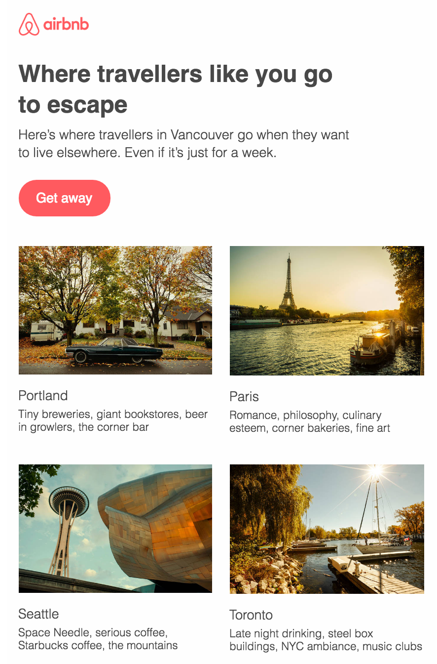
Emails like this from Airbnb, ‘What people like you do to [achieve goal]’ are personalized by location. Speak directly to your audiences and relate to them using the ‘People like you’ effect to add that extra inclusiveness.
57. Leverage the Zeigarnik Effect
The Zeigarnik Effect refers to that feeling that someone gets when something is left unfinished. Waiters are better able to remember things about tables that have unpaid bills than ones that have already paid. Akin to cliff hanger moments in your favourite TV shows.
Evernote labels their onboarding emails in a series of 5. If a recipient opens the first email they’re more likely to continue the series, moving onto the second.

Technical Email Tips
58. Use Countdown GIFs to increase urgency for webinar/event invitation emails
If urgency is something you’re trying to communicate in your email a countdown timer might help. For a special promotion, contest, or offer a countdown timer will get your audience to act quickly.
Litmus breaks down the process of adding a GIF countdown timer to your email in this short tutorial.
59. Use CTA URL parameters to pre-fill form fields to decrease work for people and increase conversion rates on the landing page
By using a prefilled formfield option you can reduce the amount of work your recipients have to do on a landing page form.
URL parameters can automatically insert recipient information into a form once they click your email’s CTA. Fields like name, email, business name can all be automatically filled into an event registration landing page form if a recipient clicks on your email CTA.
60. Use auto-submit URLs in CTA buttons to auto-register people for webinars direct from the email
Having auto-submit URLs in your CTA buttons can auto-register people for events like webinars, without them having to fill out a form.
If you already have all of their lead information it saves them from having to re-enter it for registration. Simply by clicking ‘register’ they’ll automatically be saved a seat.
61. Setup your DKIM and SPF
Internet Service Providers (ISPs), like Google, Yahoo, and Microsoft, use DKIM and SPF authentication as a way to scan incoming emails for spam or spoofed addresses. Emails that fail SPF or DKIM authentication are more likely to arrive in a spam or junk folder.
You can authenticate your domain in a few steps explained here. This will help tell ISPs that your domain is friendly and not a source of spam.
62. Some inboxes have images set to not display by default: Here’s how you can use Alt text properly when this happens
Some email clients block images by default. Most of the time users have to allow images to be shown in their inbox. Instead of showing the images, the email client may show the ‘alt’ text instead.
For those that don’t know, Alt text is a HTML tag that is used to describe the content of an image.
To account for this, marketers have the ability to style Alt text just incase the images in your email are blocked. If your images are blocked your styled Alt text will show instead and give a description of the text. Check out Litmus’ breakdown of Alt text styling here.
63. Follow the CAN-SPAM Basics
First, what is CAN-SPAM?
George W. Bush signed the CAN-SPAM Act into law in 2003, and its regulations establish how we can build our email lists and distribute commercial email messages. CAN-SPAM stands for “Controlling the Assault of Non-Solicited Pornography And Marketing.”
The penalties for not following CAN-SPAM regulations are steep. You can be charged up to $16,000 for every email you send that’s not CAN-SPAM compliant. This is not a law you want to gamble with.
To comply with CAN-SPAM laws:
- Tell your subscribers where your business is located
- Provide an easy way to opt-out or unsubscribe from your emails
- Make it clear who the email is being sent from
- Honor opt-out requests within 10 days
64. The Best Times to send emails: 8 a.m. – 10 a.m. and 3 p.m. – 4 p.m.
According to GetResponse the best time to send emails is between 8-10 in the morning and 3-4 in the afternoon. Of course it will vary according to location and target audience behaviour but generally, these are the best times to test for the highest open rates. Their research found that emails sent during these hours had 6% higher open rates.
GetResponse notes that 40% of all email is sent between 6am to noon so it might be a good idea to send before or after those times to avoid inbox clutter. Their research says to aim for the early afternoon for the best open and click-through-rates.
65. Say No to No-reply From Email Addresses
You’ve paid special attention to your subject line, optimized your pre-header text, and selected a powerful CTA. What about your reply-to email address and name?
Using a ‘no-reply’ email address will 1) show that your email is automated 2) discourage people from responding to your email. Avoid using a ‘no-reply’ email address, it’ll damage the relationship you have with the recipients who actually want to communicate with you.
To solve this problem have a dedicated inbox for email responses that can hopefully be managed by customer service. An autoresponder should let your recipients know the timeframe you’ll respond in.
66. Welcome New Subscribers with a Quick Win
This will prime them to know that they’ll get value from every email you send
As Pat Flynn writes: “Provide massive value” is probably some of the most important—but also overused and non-specific—advice we hear online. Of course we need to provide massive value, but how?! With your emails, it’s actually fairly simple.
As soon as someone subscribes to your list, share your best, most actionable tip—something people can get a result from within five minutes of implementation. It might seem counterintuitive, but providing small wins upfront is actually a huge deal.
In 1984, a Cornell professor wrote this when discussing the science of small wins: “Small wins are a steady application of a small advantage… once a small win has been accomplished, forces are set in motion that favor another small win.” Charles Duhigg wrote about it in this Lifehacker article on habits: “Small wins fuel transformative changes by leveraging tiny advantages into patterns that convince people that bigger achievements are within reach.”
Duhigg, author of The Power of Habit, has an entire chapter dedicated to the power of small wins in his book. He says that small wins form a habit and our minds go back continually to where we were rewarded, and what better habit is there to establish for your new subscriber than to open your emails? If you want people to open your emails down the road, start by rewarding them with small victories. Train your audience to make a connection between your emails and making progress, and you’re in for much larger open rates in all of your future emails.
67. Don’t set it and forget it
Email ain’t roasted chicken. Email marketing automation can be a massive time saver but it shouldn’t be set up and forgotten. Email workflows need to be constantly tested and optimized for each audience. The same work flows do not translate well to different audiences and industries. It’s nearly impossible to get it working at its best on the first try so it must be fine tuned.
68. “Ready to Go” Click to Tweet to make it easier to share (and therefore boost sharing)
Are you looking to improve the engagement of your content on social media?
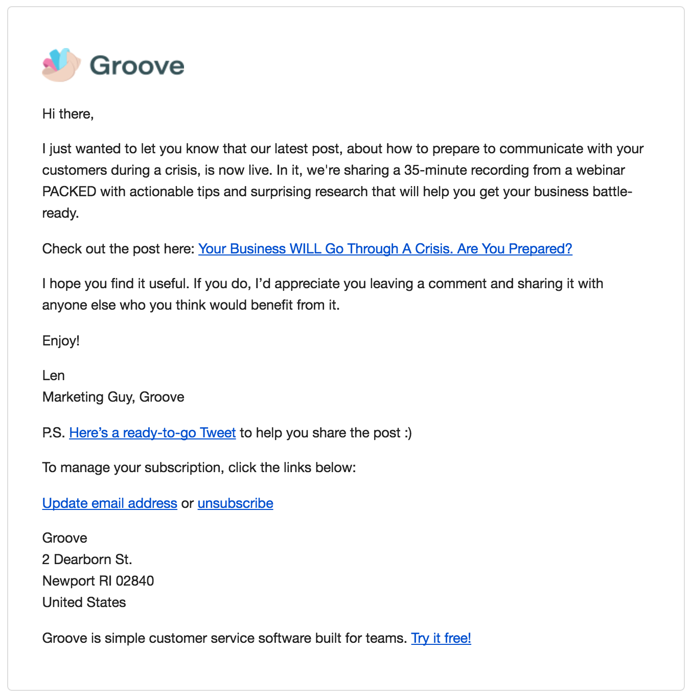
Making it easy to share your content with a pre-populated tweet like Groove does can help. When you’re sending out your latest article make life easier for your recipient by including a click to tweet for easy sharing.
Pro-tip: Keep your share buttons and click-to-tweet away from your CTA so as not to confuse your recipient. Make your CTA the most prominent element in the email and put your social share button in a ‘P.S.’ or in the footer.
69. Stop Unsubscribes with your ‘Reason You Unsubscribed’ message
When a email list member decides to unsubscribe from your list you can halt them with a ‘Reason you unsubscribed’ message on the next page.
This message page has two benefits 1) they won’t bother going through the unsubscribe process and stay on your list 2) you learn why they’ve chosen to unsubscribe to help you improve your email process. Either way a ‘Reason you unsubscribed’ can have a dramatic effect on your email strategy.
70. Use Transactional Emails to Provide a Bonus Offer
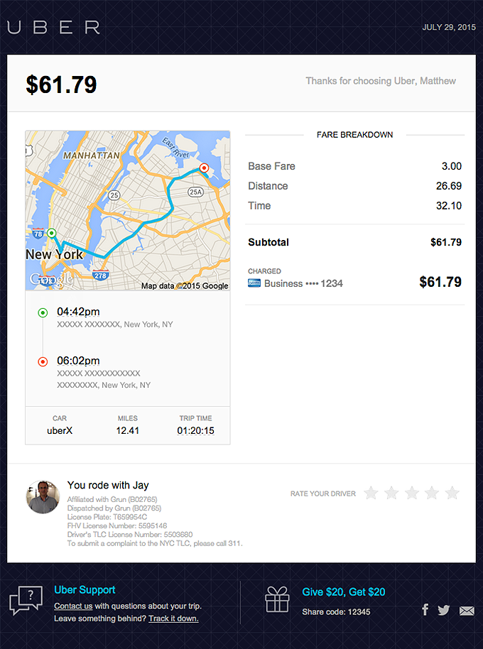
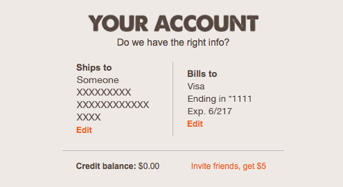
Bills and receipts don’t have to be bland text files, use them as an opportunity to include more. Extras like upsells, referral offers, and surveys are only a few options for more in your transactional emails. The great thing about transactional emails is that they’re almost always opened by the recipient.
Dollar Shave Club and Uber don’t waste this opportunity and make sure to include a referral offer in their transactional emails.
Our Favourite Email Examples
Here are some of our favourite email examples from across the web.
71. Squarespace
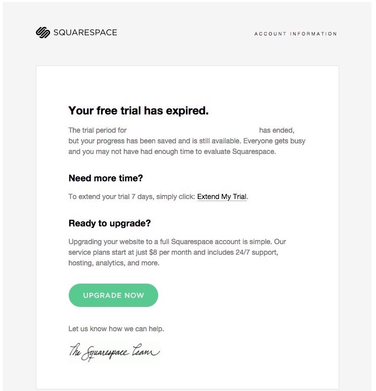
Squarespace acknowledges that, “Everyone gets busy and you may not have enough time to evaluate Squarespace.” That’s why they use this email to offer a free-trial extension if 7-days wasn’t enough. It’s a fantastic way for Squarespace to build trust with their customers and strengthen their relationship.
72. Dropbox
This is a simple update email from Dropbox for their Pro users. They gave all their Pro users 10x the space for the same price. Dropbox is known for their awesome customer support and it shows in this email.
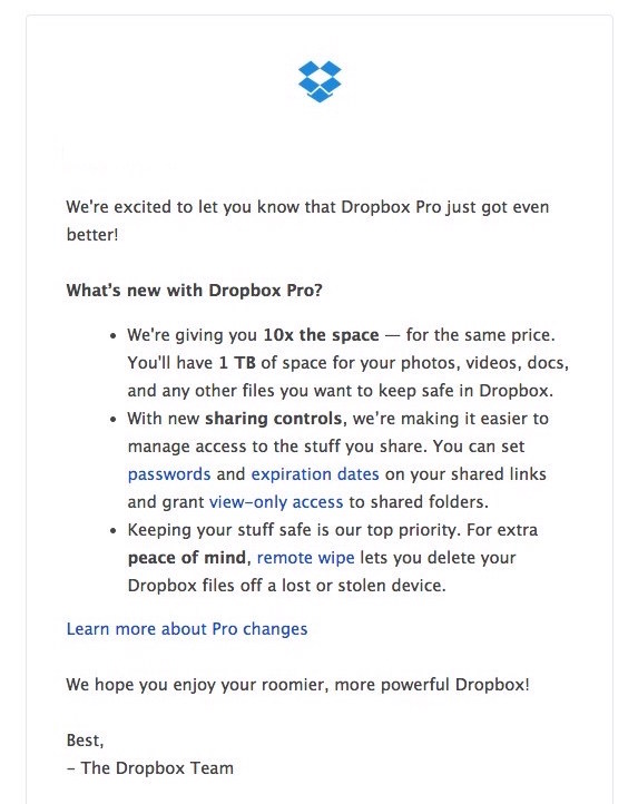
Small updates like this are a great way to stay connected with your audience. Making them feel special and part of an exclusive ‘club’ can be a powerful retention tactic.
73. Vero
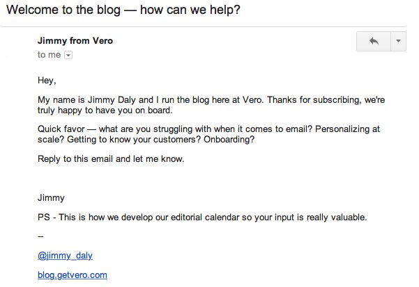
This is the welcome email new subscribers receive from the fantastic folks over at Vero. They use it to collect new subscriber feedback and to segment them by interest. It’s a smart and casual way to engage new subscribers and learn how to better serve them with content.
74. Death to Stock Photos
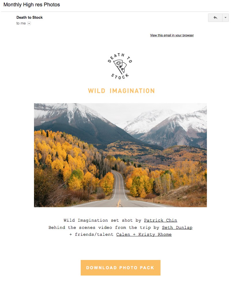
DeathtoStock sends a monthly email to their newsletter subscribers featuring their monthly photo pack. Bloggers, designer, and marketers are always looking for fresh stock photography. DeathtoStock’s beautiful FREE photo packs are a massive incentive for subscribers.
Take a hint from DeathtoStock and give your potential subscribers a big reason to subscribe.
75. Shopify
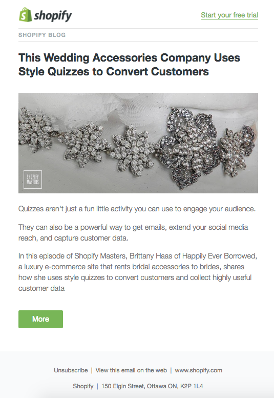
Shopify blog subscribers are sent this update each time a new post is published. Shopify keeps it simple and sticks with a few best practices:
- A single clear CTA
- A secondary sign-up CTA in the corner ‘Start your free trial’
- Simple design and bold imagery
- Succinct and descriptive copy
76. Adobe Creative Cloud
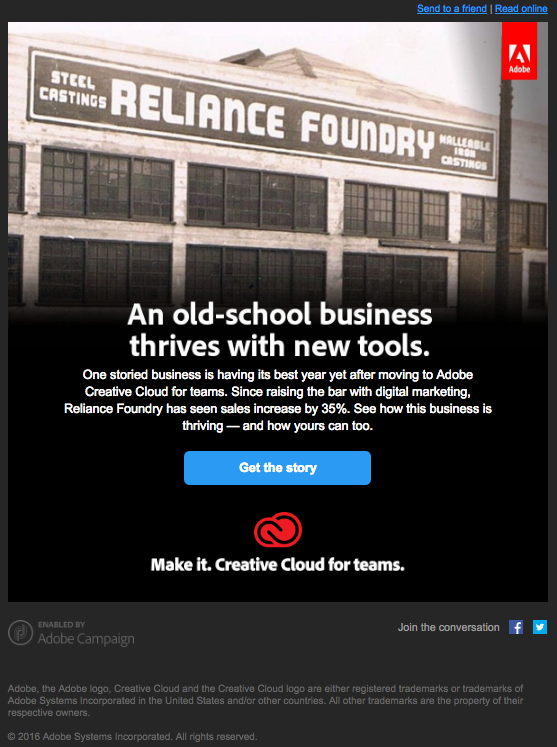
The design pros at Adobe Creative Cloud use their graphic know-how to layout an email that clicks-through. One CTA helps them direct their audience deeper and deeper down their sales funnel.
77. Litmus
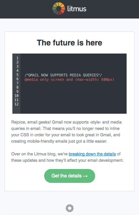
Here’s a product update email from the folks over at Litmus. Calling all ’email geeks’ they say.
The language you choose to use can go allow way towards building a strong relationship with your audience.
Note the 2 different variations of their CTA, one on the button and one inline in the copy. The clean design makes sure no one gets lost and clicks on through learn more about their new support feature.
78. Quora
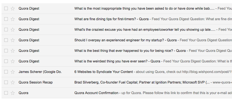
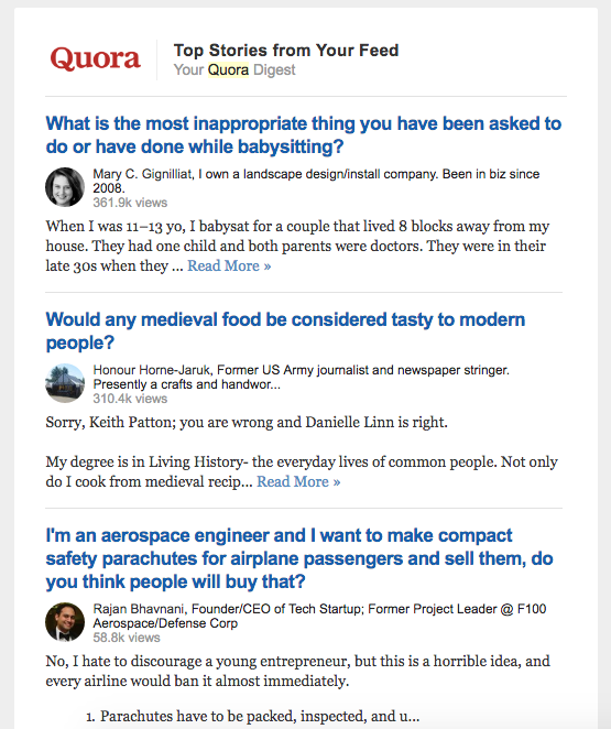
Quora emails are like a box of chocolates, you never know what you’re going to get. Oddly enough, Quora subject lines never fail to grab my attention.
We love how each Quora email is dynamically tailored to what their subscriber will find most interesting. Each email is like a personal newsletter filled with interesting reads and fun facts.
79. IFTTT
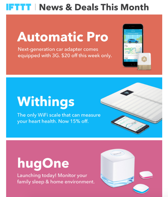
We’re big fans of the simple-automation gurus over at IFTTT. Everything from their website to their emails have a fresh and playful design that we can’t help but admire.
Their email newsletters are packed with the newest ‘recipes’ that will help you automate time-consuming tasks. The focus of their emails is simple: discover new recipes that will help you. That’s it.
Take a lesson from IFTTT and focus on simply giving your audience what they want. Really hone in on the purpose of your emails and never fail to deliver.
80. Booking.com
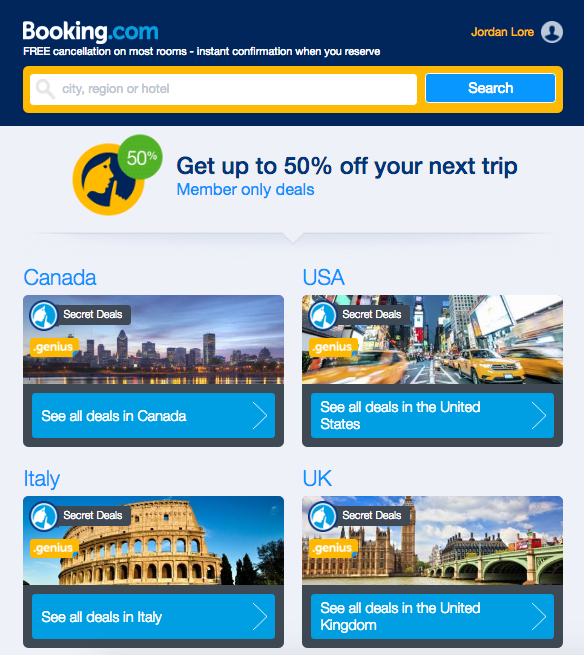
Booking.com is my favourite place to go to find last minute flight and hotel deals. By signing up to Booking.com’s email list you’ll receive deals tailored for you straight to your inbox.
Booking.com really makes good of the opportunity to fill their emails with value based on your previous interaction with their website. Email subscribers are the first to know of new deals and are given exclusive ‘member only deals’.
81. SimplyMeasured
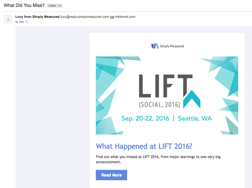
I chose to highlight this email for the subject line “What did you miss?” Simple and effective, like the business itself, SimplyMeasured spoke to my curiosity.
SimplyMeasured recently ran a conference called “LIFT 2016” and provided show notes to everyone who couldn’t attend. It was a thoughtful and convenient gesture for all the people on their email list.
Tiny and thoughtful gestures like this are a great way to keep yourself engaged with your list. The lesson here is to focus on providing value first and develop a strong relationship for conversions in the future.
82. CreativeMarket
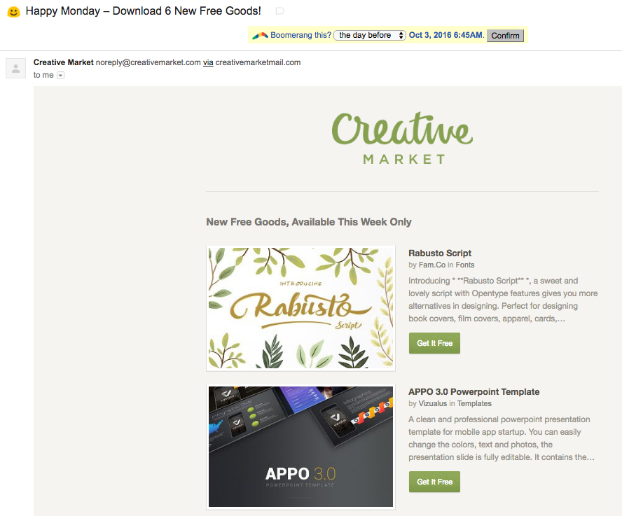
This ‘Happy Monday’ email from CreativeMarket is one that I look forward to receiving every week. It’s filled with 6 completely free creative resources; everything from free stock photos, textures, fonts, and web templates. I can’t think of any email with more value for web gurus than this one.
By providing these free resources every week, CreativeMarket develops a strong affinity with their subscribers, subscribers who, when they need creative resources will be sure to head their way first. I’ve bought fonts and creative packages from CreativeMarket myself simply because they deliver so much to me without any expected return.
83. Tumblr
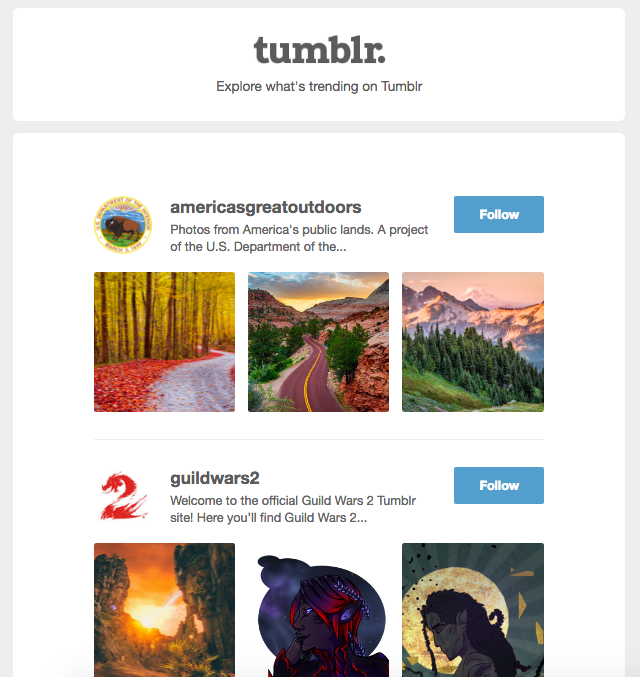
The weekly subscriber email from Tumblr is a lesson on simplicity. There really is no fluff inside their email.
Subscribe and receive Tumblr suggestions tailored toward your interests. Like Tumblr itself, imagery is a strong focus. Images do the talking so that the email can be kept minimal and emotive.
84. Yelp
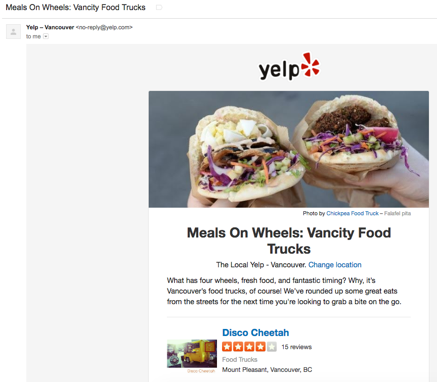
Yelp emails always manage to get me to open their emails because they’re tailored to my location. Based on my most recent activity and taste, they’ll deliver relevant restaurant suggestions.
85. EventBrite
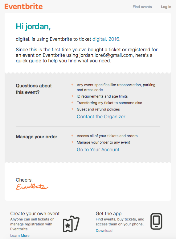
This is a transactional email from EventBrite that includes optional account CTAs that provide a next step for the recipient.
Remember that each email sent should provide a logical next step for the recipient whether that be to claim an offer, create your own event or to redeem a promo.
86. Later
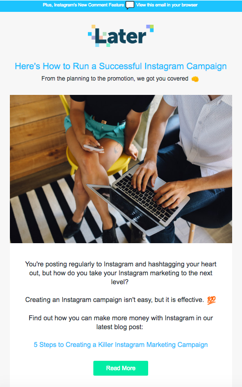
Here’s one of Later’s (the Instagram scheduling app) email newsletters. Later makes sure to keep their emails simple. Notice the 3 clickable variations of their CTA; one in the headline, one in the body copy and one in the button. Later also includes a small banner at the top announcing Instagram’s newest feature.
87. Mint
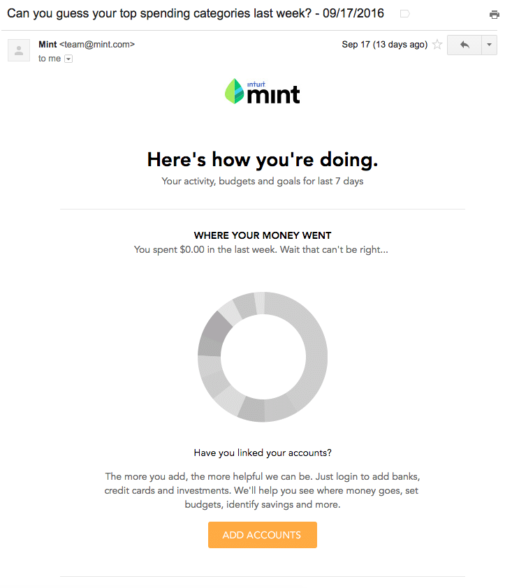
Mint, the financial management app, does away with words and replaces them with fun graphics insteads. Mint takes the graphics and visuals that make their app so easy to use and embeds them into their emails for quick user updates.
Visuals are the fastest and most efficient way to communicate with your audience. If what you want to say can be replaced with images or graphics, jump at the opportunity to use them.
88. 500px
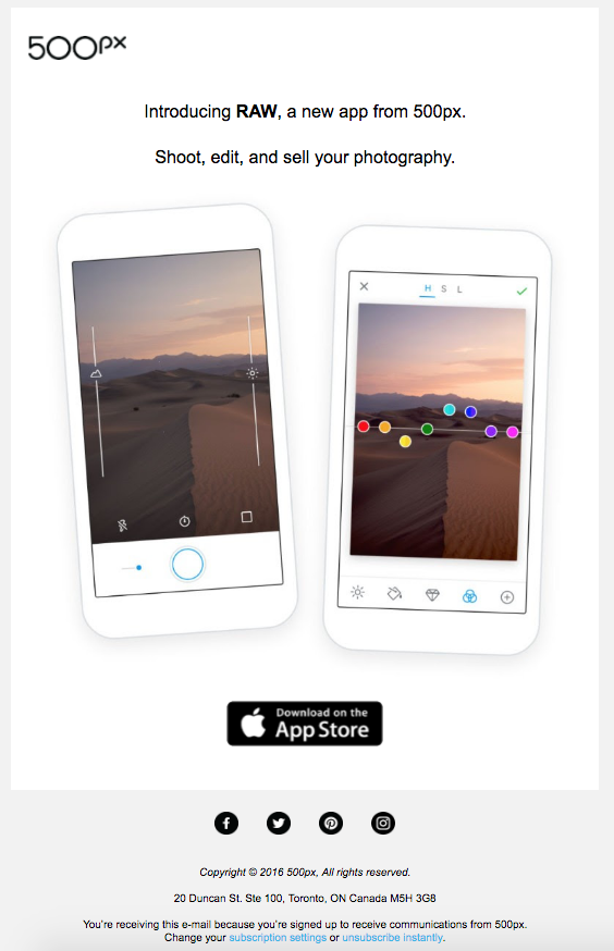
Simply powerful. Like their website and app, 500px, keep things wonderfully simple in their emails. To introduce their newest photography app, 500px uses big and bold imagery to get their point across. “Shoot, edit, and sell you photography”, that’s it.
It’s their thoughtful approach to branding that makes 500px a favourite amongst photographers and those looking for an Instagram alternative.
89. Jaybird
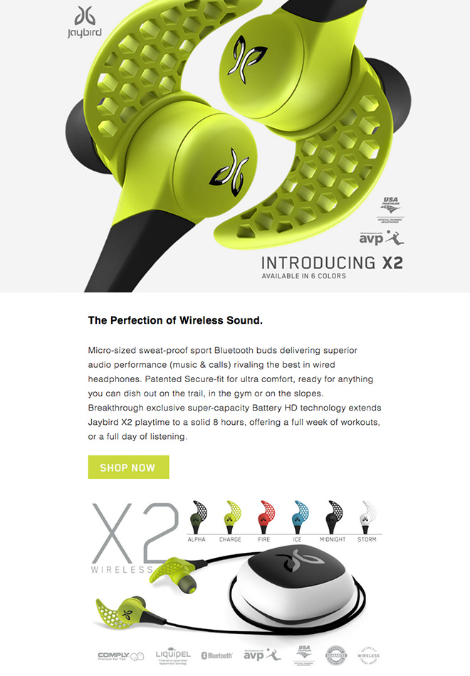
Big powerful visuals are the focus of Jaybird’s product emails. Here they’re announcing their Jaybird X2 wireless headphones and want the recipient to get up-close-and-personal with the product.
Large imagery is as close as you can get to actually holding the product. It makes the product seem larger than life and has a more emotional effect on the viewer. This email puts the Jaybird headphones on full display for maximum impact.
90. ApartmentTherapy
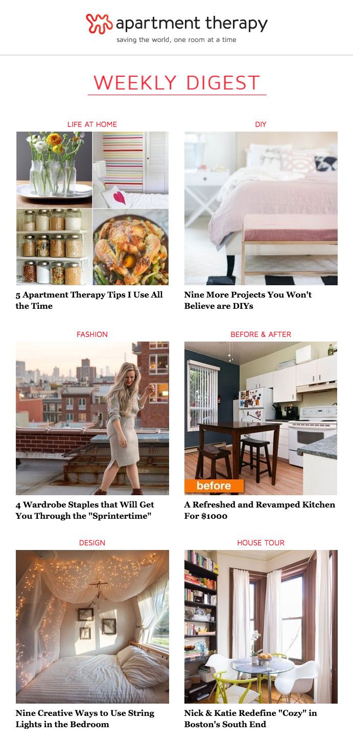
ApartmentTherapy is committed to “saving the world, one room at a time” and it shows in their email newsletters.
Each email is stacked with different articles meant to segment recipients for more personalization in the future. Each time a recipient clicks on an article they like, they’ll receive more content like that in the future.
ApartmentTherapy also uses eye-catching imagery to create an emotional connection between their content and their readership.
91. SSENSE
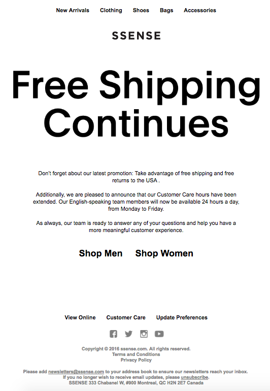
One of the premier fashion retailers on the web, SSENSE, designs all of their properties with a strong focus on minimalism. All of their copy is communication in a no-fat sort of way to make sure the message is not lost in translation.
“Free Shipping Continues” as a large bolded header is hard to ignore, no? Don’t forget about their latest promotion the body copy states. Recipients can then easily shop men or shop women — it’s that simple.
92. Haven
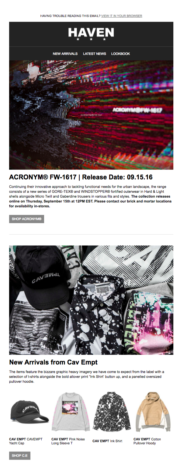
Haven takes a much more graphical approach compared to SSENSE’s minimal style. Haven uses large colourful images to put their brands in full display. Each email is like a mini look book meant to entice recipients to start browsing their stock. Clicking on the CTA buttons sends readers right to the brand page, no fuss or confusion.
93. Fred Perry
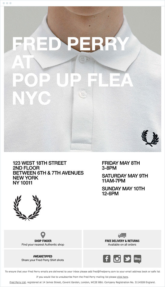
Based purely on design, Fred Perry takes the cake. Their no fuss, no fluff design style makes it easy to understand their communication. Contrasting the message of a ‘pop-up shop’ in New York with a close up image of their famous polo is fantastic.
The branding and the CTAs below make this my favourite email of the bunch.
94. Freshbooks
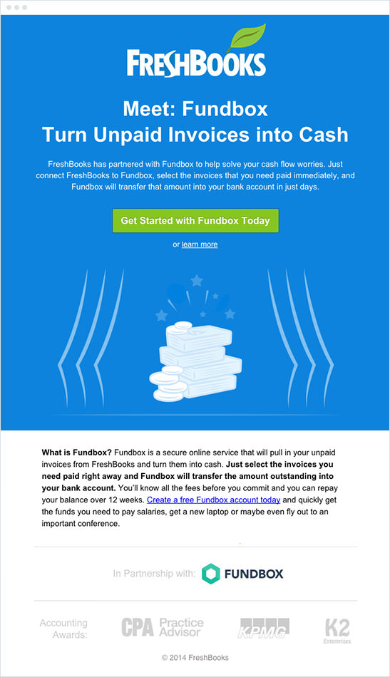
Freshbooks wants you to get started in this email message. They wisely have only one CTA in the hero image and another variation in the body copy. The logos below signal social proof and the simple USP make this email hard to resist.
95. Big Sea Design
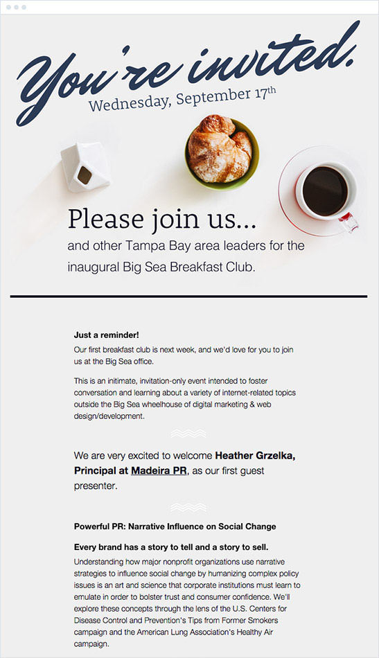
I chose this email for the simple fact that it looks like a real event invite you’d receive in the mail. Strong copywriting speaks directly to the recipient and dives down into a personal level.
96. Bodybuilding.com
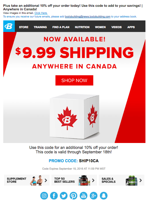
This is an offer from Bodybuilding.com to all of it’s Canadian shoppers. They use a promo code to get and retain their Canadian shoppers and are sure to include links to their other products below. We love this email for its personalization and for the fact that they show their appreciation to all of their email subscribers.
97. VSCO Film
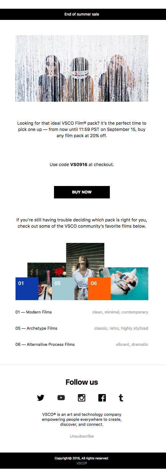
Want to make your photographers look better with minimal effort? That’s where VSCO Film wants to help. Using the promo code for email subscribers VSCO offers up tremendous value for their audience. ‘End of summer sale’ creates urgency for recipients to claim their offer before time runs out.
98. Fancy.com
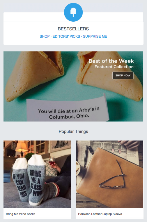
You fancy? Fancy.com subscribers are.
Fancy sends their email subscribers the hottest fancy gear weekly. Shop each new collection easily or just simply browse the big images included in the email. Click through and buy or just shop editor picks.
99. Buffer
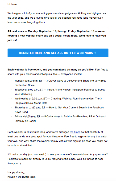
Here’s a webinar email from Kevan and the beautiful Buffer marketing team, reminding us of their upcoming webinar. Their copy makes it easy to scan and ready quickly and the bright CTA makes registering hard to miss.
100. Inboung.org
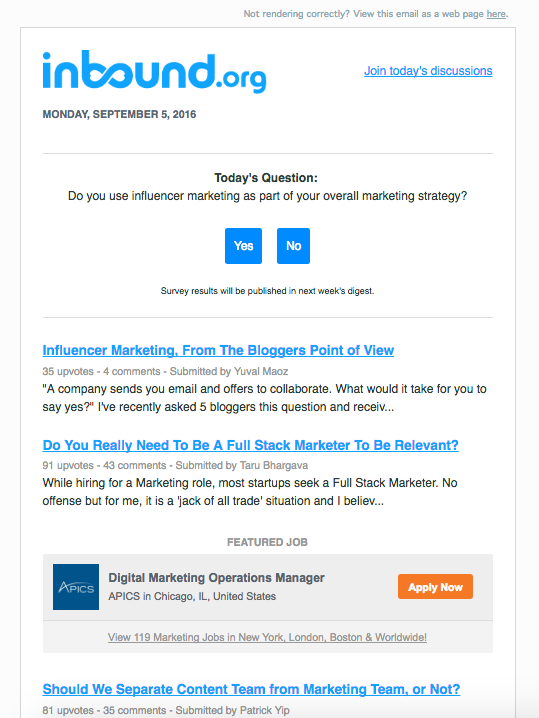
Inbound.org is always doing their best to engage with their memebers, and that extends to all of their emails. Inbound will send you a popular question or a question relevant to you in an attempt to bring you back to engage with other members. They use their list to gather data from these questions and publish helpful articles for other inbound marketers. It’s a smart way for them to increase returning users and to promote their best content.
http://www.getvero.com/resources/guides
https://www.campaignmonitor.com/best-email-marketing-campaigns/

Email Drip Campaigns
350 Strategies, ideas and examples
Click below to download the most comprehensive collection of email drip campaign strategies and examples ever compiled. Completely free.